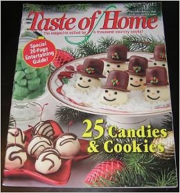
This is my title page for my article, it took me a long time to decide what my title was going to be and I have decided on Clever Chef because it flows together and sounds good but im not sure it is the title I want in the end but it seems fitting enough and i like it but i have a feeling I will come up with something better. The image that I chose for this, I feel is more of a mid shot it includes most of the shop in this picture and it is full of colors but it made it difficult to find the right fonts and colors that would allow the title and headlines to be read easily. I had to place them in spots that would allow the words to be seen. overall it turned out to be the bright title page I was looking for.

This Table of contents is very different from the cover it is more of a plane page with a white background, which is what I had planned on with such a colorful cover I wanted the contents to be simple. This helped draw more attention to the pictures and helped explain what would be in this issue without having to read the titles of the articles. I plan on adding in more pictures or maybe giving the background a simple color. The images I chose contrast each other some are lighter and others are darker. Most of these ended up being close up images because in the magazines I have researched they included mostly close ups to help give detail of the food or gardens.

This is the first page of my article which includes my overview of the shop and for this I chose a font that was easy to read and for my title i chose a font that i thought best suited Smallcakes and the color pink because that is the main color of the shop. The smaller images i included on this page were mainly closeups so that the detail could be seen because the closeups were of the food itself. The larger picture at the bottom I chose to use a wide shot because it was a picture of the variety of ice cream flavors and I thought that would be a good picture to incorporate.

This was my interview portion of my article I decided to only put one image on here because i wanted to include just one large picture making it easy to see. the title on this part of the article is the same font that is on the first page. This helped keep them together because seeing the two pages both with the same title font make it easy to connect them as one article. I wanted to keep my interview short but still meaningful so I only asked a few important questions. I felt that bolding the questions made it easier to locate where a new question began so that's why I kept it the same font but i just put it in bold because I wanted it to remain simple with all of the same font but I wanted to make it easier to read.